

New IA and content structure for a care management platform


Thanks to the entire team's hard work on the CRM upgrade, customer satisfaction increased by over 37%, and the company's client base almost doubled in four months after launch.
My contribution to success, as the sole Product Designer, was a deep understanding of customers' needs and pain points, and, based on this, building a new information architecture, content structure, and a new visual style (the first company's design system and intuitive UI.)
Background
Welkin Health is a highly configurable patient-centric care management platform that guides teams through their patient's care, keeping them on track.
Business objectives:
-
Improve operational efficiency and effectiveness to reduce client churn and boost client retention
-
Modernize and optimize the CRM to meet the increasing client demands and stay ahead in the market
In my first week, I was asked to make recommendations on how to improve the platform design, primarily the Care Portal.
Challenges
-
The Welkin Health CRM is a configurable platform. Utilizing a No-code editor customers should be able to customize the Care Portal according to their goals. I needed to create something like Lego pieces with guidelines to help people configure a cohesive system and, at the same time, prevent the interface from turning into a total mess
-
A new engineering team was working on a feature-heavy version with strict deadlines. So, I had only a few days to get my proposals ready
I then continued the research by conducting a UX competitive analysis of Welkin’s direct and indirect competitors, as their CRM systems offered solutions people used to get the job done.
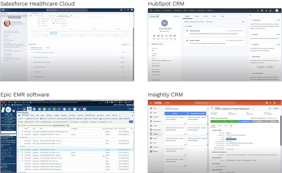
My goal was to better understand the subject area, which would help come up with a solution that, in turn, would make our customer lives easier. While analyzing, I discovered some strengths that could improve the overall user experience of our CRM.

Finally, I performed a UX evaluation of the Care Portal to analyze the layout and information hierarchy and identify usability issues and opportunities for improvement throughout the user journey.
What people said
-
"This is slick and professional looking!"
-
"It’s hard to overstate how far this has come."
-
"This is on a completely different level!"
-
"This is something I could see recommending to any company building a care management program."
Closing thoughts
By implementing a new information architecture and content structure, we have helped our customers significantly reduce time and effort when interacting with the Care Portal, and their satisfaction with the product has increased by more than 37%. All this contributed to achieving their goals of better serving their patients.
The upgraded platform got a much better "job" done than before because four months after the launch, Welkin Health almost doubled its client base.
Nevertheless, there is some food for thought out there. We packed a lot of changes in the launch at once - new IA, UI, and rebranding. But our customers spent time and energy to get benefits from the previous design, no matter how bad it was. When we forced people to throw away their investments, they were rightly upset. However, by regularly communicating with users, the product team did their best to show why the design changes were valuable to the users. And they got excited when the benefits were clear.
To achieve their goals, Welkin Health carried out strategic transformations through a large-scale upgrade: they took a risk, and they won.
To determine what design improvements to make, I needed to figure out what was wrong with the Care Portal and why.
Before I joined the company, a product manager started conducting research applying Jobs-to-be-done approach to deeply understand what people want to achieve. That way we can build a better solution that reflects those desires.
Welkin's clients are companies of various sizes and specializations. Our customers are these companies' employees, such as social workers, health coaches, nurses, therapists, and administrators. In the JTBD, we needed to identify groups of people who use CRM to perform the job, regardless of the job title. Thus, we created two high-level groups as job performers:
-
Healthcare service providers
-
Care coordinators who manage patient care delivery
Together with the product manager, I analyzed the raw data obtained during 12 interviews to determine:
-
Job statements that define the main job and provide a clear understanding of what customers need (the job statement formula: Action + Object + Clarifier)
-
Desired-outcome statements as the metrics customers can use to measure success when getting a job done (Direction + Metric + Qualifier)
It helped better understand what customers were trying to achieve and make the teams think about outcomes.
Process


What I learned
The deeper I delved, the clearer it became why customers spent a lot of time and effort interacting with the platform and what caused them negative emotions:
-
Irrelevant content that overwhelmed customers: for example, a timeline page contained sections that were not related to the timeline at all. They were cognitive distractions and just created clutter
-
Poor layout: important pieces of information that people used daily were placed haphazardly in a small right sidebar. At the same time, the large central part of the screen was often used as "For Your Information”
Customers found it very inconvenient, but there was no other way to display the information. The irrational use of the screen space, in general, had led to poor usability.

-
Interaction cost: people had to either scroll up and down the right sidebar or collapse and expand each section to get the information. It was annoying.

-
Inefficient workflows: some content was hidden, making it challenging for customers to access. For example, on the right sidebar, customers could only see 3 columns of, say, a patient's medical history. To view the entire table, which had 13 columns, users first had to click on the View button in the upper right and then a table frame showed up in the lower left. But even in this case, customers had to scroll horizontally inside the frame, which had a fixed width.
There was no proximity between the action (clicking on the View button) and the result (a table view) on the page. It was contrary to customers’ expectations.

Issues with a seamless user experience:
-
For example, the list of recent messages was located on the left sidebar, and the texts were displayed only partially
-
To view the entire message, customers had to first find it on the timeline tab in the center and then click on it
-
To send an email or SMS, users should go to the upper-right corner and click on the Action icon or on the More icon to find the appropriate button and hit it. In this way, to complete the task, users had to jump all over the screen like grasshoppers

A seamless user experience doesn’t make users think twice about what to do next. Instead, it should adapt to users’ needs and behaviors, and seem natural to them.
Ideas and their visualization
Interaction with the entire platform was very inefficient and time-consuming, and all these issues substantially slowed down customers' work.

Having the lists of collected issues and my assumptions, I began to turn intangible insights into tangible doodles...
There were so many problems in the visual design, information architecture, and overall user experience that it was obvious that a comprehensive overhaul was needed. Having the lists of collected issues, I began to turn intangible insights into tangible sketches. After several iterations, I put the ideas together in the wireframes.
Solution

After thinking more carefully, I found some drawbacks in this design:
-
A very long horizontal navigation can lead to poor usability
-
Since our customers use tablets when working with patients, the left panel can occupy a lot of space on small screens. So I found this layout unreasonable.
-
So, I assumed that it would be better to display all the personal information instead of a part, but only when it is really necessary
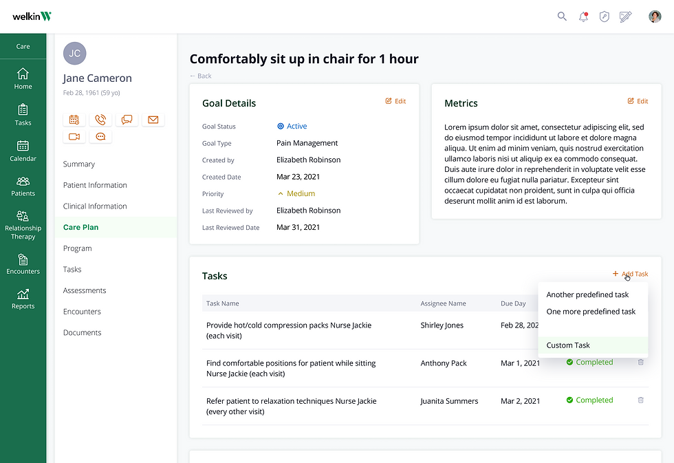
As a result, I designed another option:

Discussion
-
While presenting my suggestions to stakeholders, there was some pushback from a CTO because he did not expect to see such significant modifications, and he said that engineers would need to make a bunch of changes in the backend
-
The other thing was that our customers expected some changes, but they might not be ready to accept a radically changed design that would include new IA, UI, and rebranding
However, stakeholders saw the benefits of the new solution. I suggested getting customer feedback using a prototype to see how they perceived the new design. Having worked with the old interface for years, it was unusual for people to see a completely different one even in black and white. However, after playing around with the prototype, all customers confirmed the new structure was much more intuitive. It was easier to get the necessary information without jumping all over the screen.
Eventually, a CEO decided to move forward with the new solution and the team started working on it.
A new user interface started with building of a new component library, and then mockups.
New look and feel
New look and feel
A new user interface started with the building of a new component library and then designing mockups.


How we measured the design
Whenever possible, I created a prototype so that the product team could validate their assumptions, before a single line of code was written. Then we measured Customer Effort Score by using a two question survey. We asked users to answer the question "How much effort did you personally have to put in to complete a [task name]?" on a 7-point Likert scale. The follow-up question about the reason for their answer choice specified what was wrong or right in their experience.
-
An average score of 5-6 points (depending on a task complexity) indicated that we were moving in the right direction: reducing customer effort
-
The lower extreme values of 1-2 points helped us identify what we need to focus our attention on
Right after the launch, the CEO got some feedback from our customers and investors. Here are a few quotes from the list she put in our Slack channel.
Minimize the time and effort of customers to complete tasks in CRM so that they can focus more on delivering better care to patients.
Desired-outcome statement
Since I also designed other CRM products, my goal was to develop a consistent style for the entire platform. I created a unified feel yet a slightly different look for the Care Portal, the No-Code Editor, and the Admin Console.
It was crucial for us to avoid serious mistakes and make sure we were moving in the right direction. So the product manager and I communicated closely with customers and conducted usability tests before a single line of code was written.
We measured the Customer Effort Score by asking users, "How much effort did you personally have to put in to complete a [task name]?" and asking them to rate their answer on a 7-point Likert scale. An average score of 5-6 points indicated that we were doing exactly right - reducing customer effort. The lower extreme values of 1-2 points, along with the follow-up question about the reason for their answer, helped us determine what we needed to focus on.
Right after the launch, the CEO got some stakeholders' feedback.
Validation


Admin Console
No-Code Editor
The core job-to-be-done is defined as a “functional job.” At the same time, it has important emotional aspects, which can be no less powerful than functional ones. Due to strict deadlines, I needed to uncover customer pain points as quickly as possible. In this case, interviewing extreme customers could help a lot.
Who were Welkin's extreme customers?
The extreme users are those on the margins of a challenge who can provide unique insights because of their special needs, perspectives, or actions. I chose extreme customers based on the duration of using the platform:
-
New customers who started using CRM within the last 6 months. Their first impressions were still fresh, and they remembered them well enough
-
Experienced customers who have used CRM for longer than 6 months. They could share creative workarounds for the challenges they encountered when interacting with CRM
While analyzing, I grouped the pain points into categories:

I created a matrix to visualize pain points based on their impact and frequency. It helped stakeholders better understand the key pain points and their implications, making it easier to prioritize and address them effectively.

Based on all the findings from this discovery phase, I formulated the main desired outcome that should be achieved if the platform does the right "job" for the customers:
