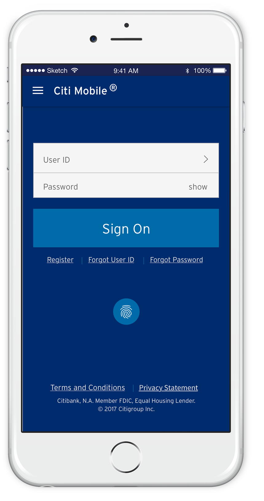
The Cardless Cash feature for the Citibank Mobile App


Solution
In order to identify what kind of feature I had to come up with and design, I performed:
Research
to understand what were the most in-demand features customers use in mobile banking apps
Analysis
to better apply the findings
Exploration
to design ideas and validate them via users' feedback
Production
where the high-fidelity design was fleshed out
Process
Research
I conducted five 1:1 interviews and an online survey in which 11 individuals participated. These research methods played a crucial role in understanding what was important to customers when using banking mobile apps.
Amongst the questions were the following:
-
What do you like about your mobile banking app? What features do you like?
-
What difficulties do you face when using your mobile banking app?
-
What doesn't your mobile banking app do?
Since all the mobile banking apps provide similar products and services, there was a lot in common in the respondents' answers. Basically, participants were satisfied with their mobile apps because they were convenient, fast, and easy to use.
My bank is always at hand if I need it.
I can deposit my check easily if I am not close to a bank.
Analysis
To better understand users’ feelings, pain points, and motivations, I grouped their answers in an empathy map. It was the first step on my way to finding a solution to the established problem.

Based on the empathy map I, synthesized the following persona to help guide my designs. Sean is a young professional. He uses the Citibank mobile app to make transfers, check the balance, and deposit his checks. Now he doesn't need to go to a branch at all. But he would like to have a more effective and simple multifunctional app to use on the go.

Exploration
It was time to generate ideas to find the right solution to the problem. Keeping in mind Sean's pain points and needs, I formulated the challenges as "How Might We" statements. I chose two from the 14 statements I had made:
-
How might we enable Sean to see and manage all his financial world in one place?
-
How might we help Sean get cash when he has forgotten his wallet?
I moved on to the Crazy Eights exercise and came up with eight different ideas for each “How Might We” statement. It helped me think out of the box and ultimately define the optimal design solution.

After analyzing this exercise, I decided to focus on the idea of how Sean can get cash when he has forgotten his wallet. This is particularly interesting because Citibank does not provide this service to clients yet.
In developing the idea, I came up with three scenarios:
-
How Sean can withdraw cardless cash when he stands in front of the ATM
-
How Sean can withdraw cardless cash if there is no ATM around him
-
How Sean can allow his family members and friends to withdraw cardless cash from his account
I created storyboards to visualize these scenarios.

Problem
Citibank has approximately 200 million customer accounts and conducts business in more than 160 countries. The latest studies show an ongoing increase in mobile usage compared to desktop. *
The sector where a desktop is still relatively important is banking. * Therefore, Citibank wants to encourage customers to use a mobile app by designing new features using the latest technology.
I do not work at Citibank and am not affiliated with it.
This is a personal project!
My Role was leading the design through research, UX strategy, UI design, prototyping, and usability testing
There were some features the mobile apps, including Citibank app, were not doing, such as:
-
To get cash without using a credit/debit card
-
To create virtual cards to add an extra level of security for online purchases
-
To import customer's accounts and cards from other banks in order to manage all the accounts within one mobile banking app
-
To integrate the app with Venmo and Google payment systems
My banking app does not give me the same visibility as its desktop version.
There is neither a Citibank office nor ATM in my area. So it's tricky for me to get cash if I want to tip a pizza guy, for instance.
Based on storyboards, I constructed a task flow to outline key steps in the flow.

To visualize an abstract user flow, I sketched key wireframes and used the Marvel app to transform them into an interactive prototype.

Then I conducted a usability test with four tech-savvy participants. It was more like an exciting conversation than a test in its pure state. Participants discussed each screen in detail and gave me recommendations that I put together in an affinity map.

At this stage, I followed the Citibank brand style to create the mobile app UI Kit. My goal was to design high-fidelity wireframes so that they were embedded well and seamlessly with the rest of the application.

Production
I created a Hi-Fi prototype and tested it with Citibank customers to get feedback.
All the participants successfully completed tasks by following the scenarios below:
-
You have forgotten your wallet, but you need cash. You are near the Citibank ATM and you are going to use your phone to withdraw the cash
-
You really need cash but there is neither ATM nor Citibank office around you. For that reason, you are going to use your phone to withdraw cash from your banking account and order money delivery (like pizza delivery)
-
Your brother has forgotten his wallet, but he needs cash. He is near the Citibank ATM. He calls you and asks for your help to withdraw cash from your account. You are going to use your phone to allow your brother to get cash
Issue: there were two very similar menu items in the main menu - “Withdraw Cardless Cash” and “Send Cardless Cash”, which confused participants. They suggested combining these menu items into one "Cardless Cash" menu item. Tapping on it opens a new tab with these menu items.
The feedback helped me iterate the initial design and eventually create a more user-friendly experience.
Iteration
Closing thoughts
Citibank mobile app has been a very inspirational project which I learned a lot from. When I started working on it I had no idea what feature I need to come up in order to improve the Citibank mobile app. When doing the ideation exercises I was able to generate ideas and it really helped me find the solution. Thanks to testings and iterations, I improved and polished the design.
As the next step, I would explore the solutions to the other "How might we..." and design a user experience that could allow users to manage all their financial world in one place using, for instance, Google Glass or Blockchain technology.
I like the idea of using public and private keys for the code encrypting to send to a recipient.
I think drone delivery is a completely unreal crazy thing, but it's a cool and creative idea.
The idea of sending cash would be of interest to parents who often forget to give money to their kids.

